




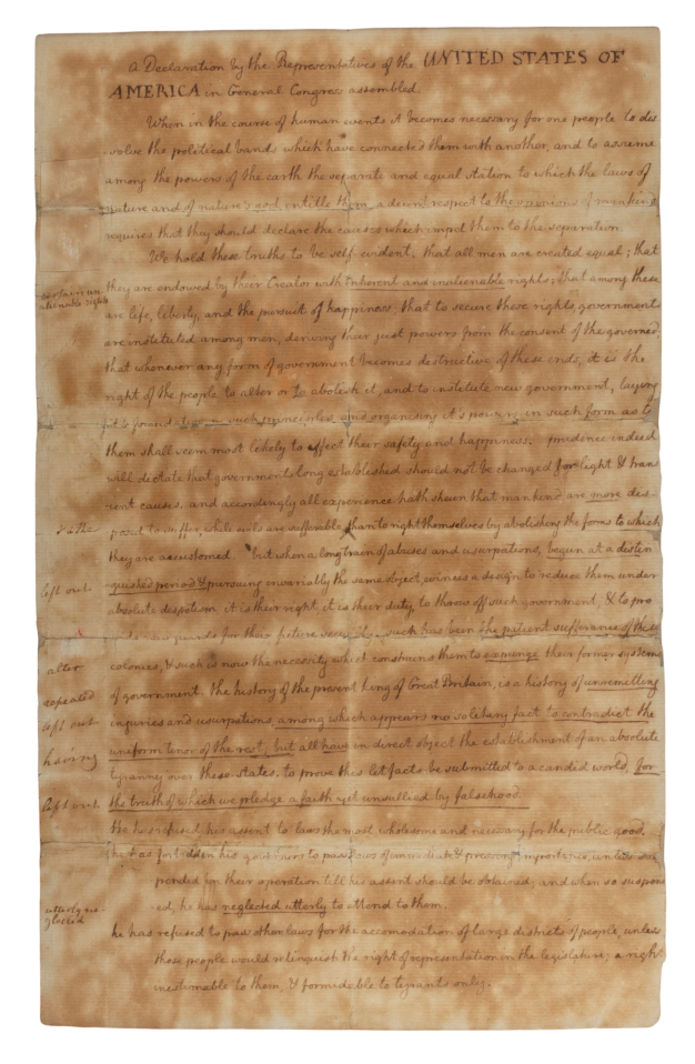
Image: Thomas Jefferson, Declaration of Independence, APS Digital Library
Have you ever walked into a museum gallery and wondered, “why is it so dark in here?” You lean in closer and squint. A sign reminds you to not use flash photography. You carefully navigate the space. As a visitor, I have found some of the darker museums unsettling. As a conservator, I am acutely aware that the balance between accessibility and preservation can feel just as uneasy.
Light is a common cause of damage to collection materials. It can lead to visible changes such as fading of inks, yellowing or bleaching of paper, and structural weakening or embrittlement of paper and textiles. Both visible light and ultraviolet radiation (UV) provide energy to chemical reactions that drive deterioration in the organic materials our collections are made of. Over time, these changes can diminish the readability of historic letters, alter the appearance of centuries-old embroidery, and reduce the information we can gather from material evidence. Light damage is irreversible and cumulative: conservators cannot treat it, and every light exposure builds upon what came before.
As caretakers of materials and of the human stories captured in them, one thing we can do to preserve these stories for future generations is to manage when and how materials are exposed to light. The extent of light damage depends on three factors: the intensity of the light, the duration of the exposure, and the sensitivity of the materials themselves. While the material sensitivity is inherent, the first two are variables we can control.
But how do we determine how much light is too much for a specific object? General guidelines offer a useful starting point, but they do not account for the wide variety of materials, inks, and dyes that make up collections. To make more informed decisions, we need tools that allow us to understand how individual objects respond to light.
In preparing for our semiquincentennial exhibition, These Truths: The Declarations of Independence, this question became especially urgent for Thomas Jeffersons’ handwritten draft of the Declaration of Independence, donated to the American Philosophical Society in 1825. The APS was so proud to have it in the collection that for years it was displayed in a window for all to see. As a result of this loving attention, the draft bears evidence of environmental stress and severe light exposure. Some passages, originally written in dark iron gall ink, are now faint and difficult to read.
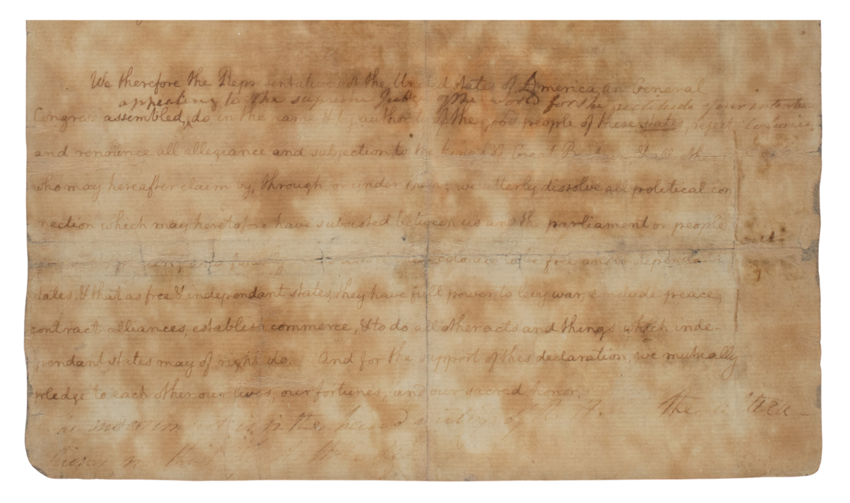
Thomas Jefferson, Declaration of Independence, APS Digital Library
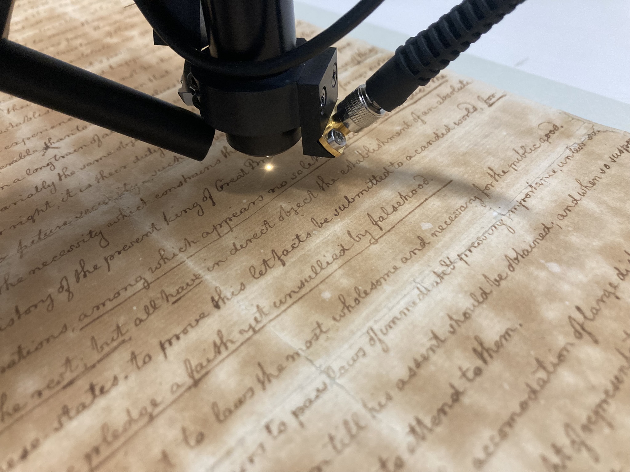
Because this treasure has already endured so much, and display would expose it to even more light, we needed to understand how it responds to light today. Enter microfade testing (MFT), a tool that allows us to measure and predict how much light exposure a document can sustain before changes become visible to the human eye. It focuses an intense beam of light on a minuscule area. By changing the intensity of the light and measuring the color change caused by the test, we can determine the fading rate of the document without causing visible damage.
On a dreary morning in March 2025, we carefully packed Jefferson’s draft and drove to the Philadelphia Art Museum to meet with senior paper conservator Thomas Primeau, who provided the equipment and the expertise to carry out the testing and analysis. We spent the morning together in a small MFT lab, carefully selecting test locations representing different regions of coloration in both paper and ink, listening to the soft whirring of the instrument, and interpreting the graphs unfolding on the screen.
Each graph represents a test location’s response to light over time, showing how quickly fading begins to occur. Although these changes are invisible to the naked eye, the results identify which parts of the draft are most vulnerable. These areas determine the overall light sensitivity of the document. The results are compared to the Blue Wool Scale (BWS), a standard based on eight samples of blue-dyed wool with known fading sensitivities and rates.
The most fading-prone ink areas in the Draft are equivalent to BWS 1-2 on a scale of 1-8, where 1 is the most light sensitive and 8 is the least light sensitive. This indicates that some of the ink remains extremely light sensitive and prone to fading. Our light-use policies are based on these most sensitive areas.
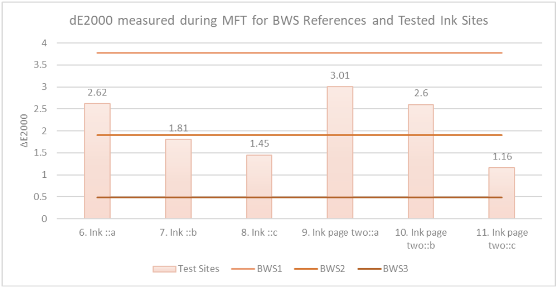
Color change — ink fading in this case — is described using the concept of a Just Noticeable Difference (JND), which defines the smallest amount of fading visible to the human eye (ΔE2000 ≈ 1.5 JND, with ΔE2000 representing the difference between two colors based on human perception). In consultation with our curatorial team, we decided to allow 1 JND per 100 years. In other words: the slightest amount of visible fading is allowed over one century, which represents three to four generations of researchers and visitors. Given the sensitivity of the document, this translates into three to five exhibitions per century with our current exhibition length and lighting conditions.
When you step into the APS museum gallery for These Truths: The Declarations of Independence, take note of the careful choreography of light and space. While the light on Jefferson’s draft may appear bright relative to the surrounding gallery, the well-diffused wash is designed to illuminate the surface evenly without directional spotlighting. What our eyes perceive as brightness is shaped by color temperature as well as by intensity. The light level on the document itself measures within acceptable limits.
These choices reflect a balance we struck between making Jefferson’s draft accessible to a wide audience, preserving them, and ensuring that the gallery is comfortable to navigate. We invite you to spend time with this draft for the Declaration of Independence. Read the words closely, with the knowledge that they will be accessible for years to come through thoughtful, evidence-based care - no sunlight required.
Many thanks to Thomas Primeau, Renée Wolcott and Anne Downey for their work on this project.
References
Michalski, S. (2018) ‘Agents of Deterioration: Light, Ultraviolet and Infrared.’ Canadian Conservation Institute, Government of Canada.
CIE (Commission Internationale de l’Eclairage). CIE 142:2001. Improvement to Industrial Colour-Difference Evaluation. CIE Publication No. 142-2001. Vienna, Austria: Central Bureau of the CIE.